Tailwind Breakpoints Bookmarklet
Debugging across different viewports in Tailwind can mean a lot of tedious window-resizing. With a simple Bookmarklet, we can make that process a bit easier.
TailwindCSS has multiple pre-defined breakpoints. The class md:text-red-500, for example, only applies the red text color on the md viewport and bigger.
When coding for such viewports, you often debug styles across them. Especially when dealing with a different resolution on a secondary monitor, it is often unclear how wide your browser window actually is.
The Chrome Dev Tool show the viewport dimensions only for few seconds after resizing the window. Constantly adjusting the size of the window is tedious. The mental maths of Which viewport is 1192px again?1 is still required as well.
StackOverflow to the rescue!
After a quick google, StackOverflow pointed me in the right direction with a script that logs the viewport dimensions to the console2. Some refactoring and the functionality is there:
var b = document.createElement("div");
var bS = b.style;
const prefixText = () => {
  const width = window.innerWidth;
  let prefix = "";
  if (width > 1536) {
    prefix = "2xl";
  } else if (width > 1280) {
    prefix = "xl";
  } else if (width > 1024) {
    prefix = "lg";
  } else if (width > 768) {
    prefix = "md";
  } else if (width > 640) {
    prefix = "sm";
  }
  return `${prefix} (${width})`;
};
bS.position = "fixed";
bS.bottom = 0;
bS.right = 0;
bS.background = "#fff";
bS.padding = "5px";
bS.zIndex = 100000;
bS.display = "block";
bS.fontSize = "12px";
bS.fontFamily = "JetBrains Mono";
b.innerText = prefixText();
b.addEventListener(
  "click",
  function () {
    bS.display = "none";
  },
  false,
);
document.body.appendChild(b);
window.addEventListener("resize", function (event) {
  bS.display = "block";
  b.innerText = prefixText();
});
It’s a bit verbose but works! (You can test the code by pasting it into the Dev Tools console).
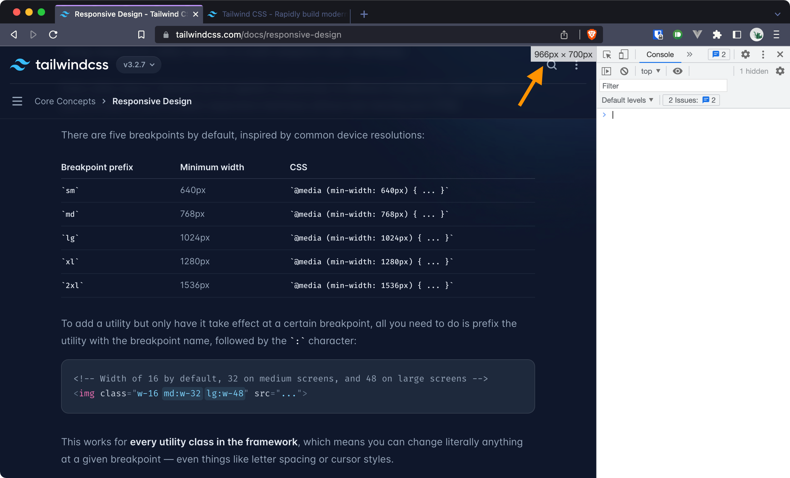
A container at the bottom right of the screen now always shows the current viewport and the width in px.
Bookmarklet it!
Bookmarklets are a bit of a throwback but they work great for this use case. They behave just like a regular site bookmark but run JavaScript when clicked.
This is what our code from above looks like when formatted for a bookmarklet.
javascript: (() => { var b = document.createElement("div"); var bS = b.style; const prefixText = () => { const width = window.innerWidth; let prefix = ""; if (width > 1536) { prefix = "2xl"; } else if (width > 1280) { prefix = "xl"; } else if (width > 1024) { prefix = "lg"; } else if (width > 768) { prefix = "md"; } else if (width > 640) { prefix = "sm"; } return `${prefix} (${width})`; }; bS.position = "fixed"; bS.bottom = 0; bS.right = 0; bS.background = "#fff"; bS.padding = "5px"; bS.zIndex = 100000; bS.display = "block"; bS.fontSize = "12px"; bS.fontFamily = "system-ui"; b.innerText = prefixText(); b.addEventListener( "click", function () { bS.display = "none"; }, false); document.body.appendChild(b); window.addEventListener("resize", function (event) { bS.display = "block"; b.innerText = prefixText(); }); })();
You can create a new bookmarklet by adding a new bookmark and pasting the code above into it. Anytime you click the bookmark, this code gets executed and provides you with a handy overview of the current viewport!
Conclusion
This solution is much better than my previous dev-tools-resizing workflow. One click at the bookmarks bar and I know exactly which viewport I’m in. The only thing that’s missing is that the container is not persistent. It disappears on a page reload. Still, it works well so far and has lead me to using my bookmarks bar a lot more!