Obsidian Grid Callouts
tldr: Jump straight to the implementation.
Arranging Obsidian content in columns without any plugins
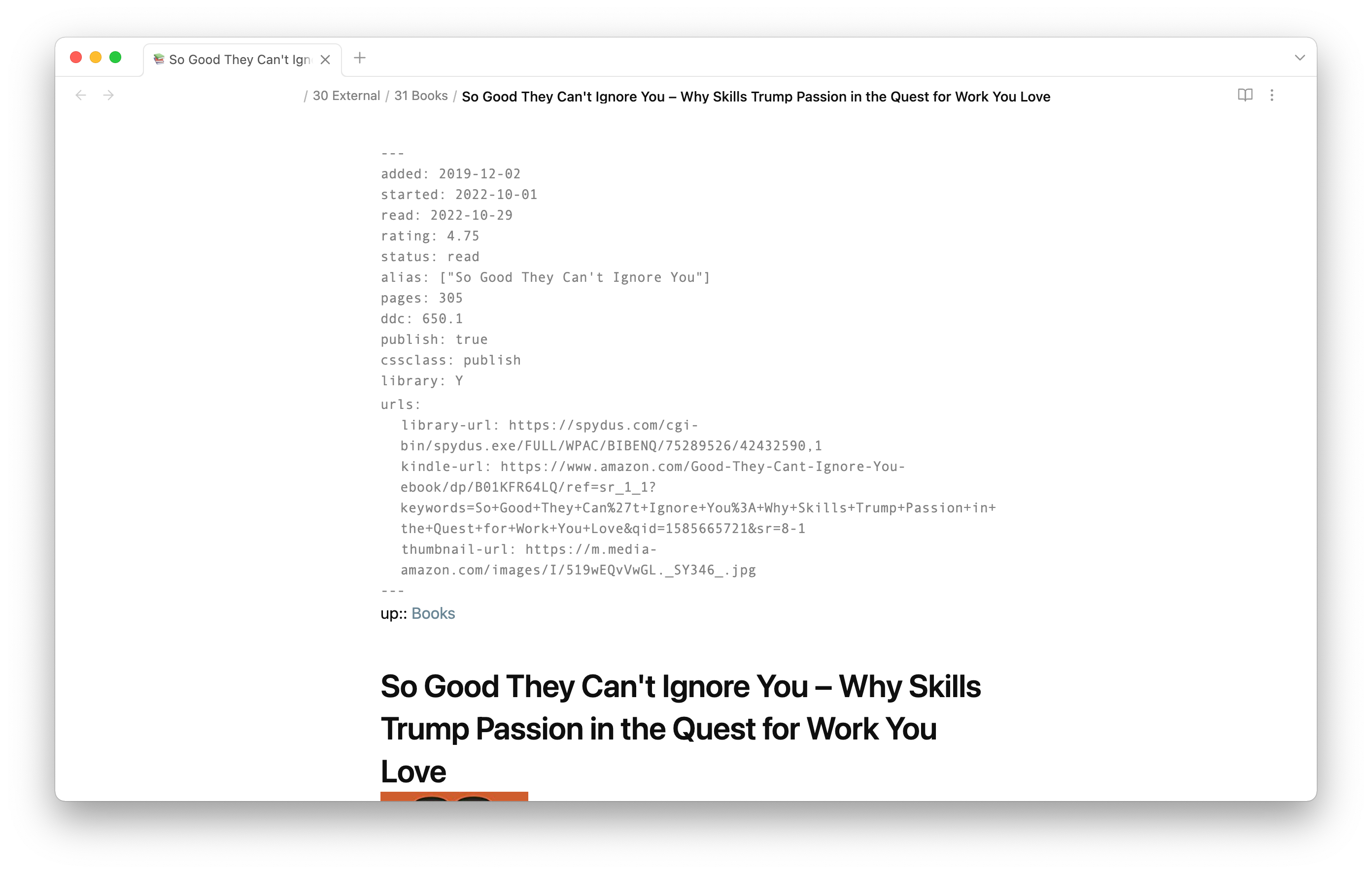
Recently, I’ve been looking to rearrange the way I structure notes on books in Obsidian. In order to be able to display, sort and query book notes in various ways, I usually add a ton of metadata in the note’s frontmatter.
It works, but it’s not pretty. Anytime I open a book note there is a gray wall of text to scroll past.
To make this a bit more manageable, I separated the metadata into fields related to the book (“About”) and my progress (“Reading”). Especially with Obsidian’s 1.0 redesign, callouts have become as nice looking as practical. I moved the fields from the YAML metadata to inline dataview fields.
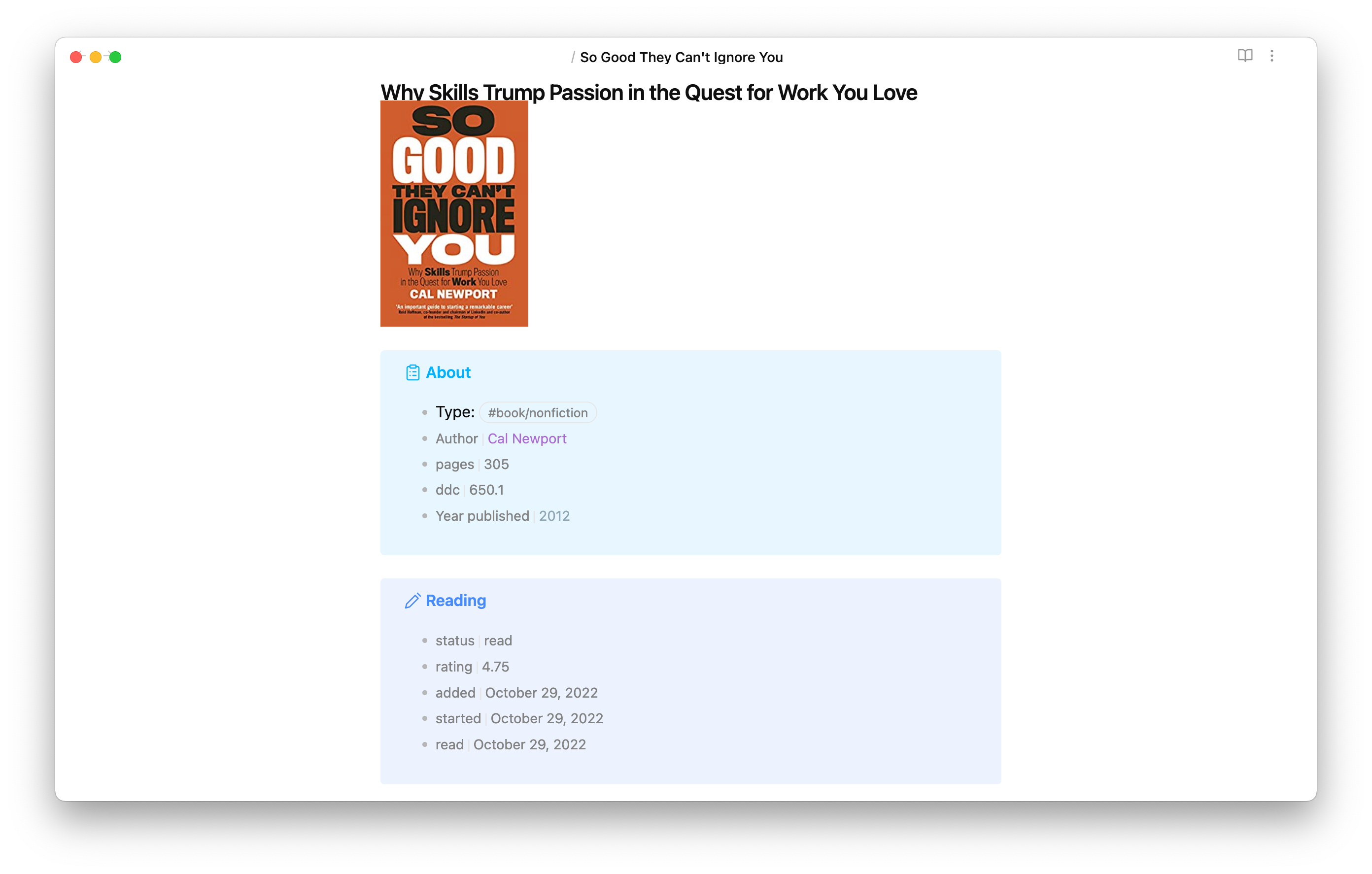
Looks much cleaner and is much easier to scan! However, it still takes up a fair bit of vertical space despite the content not being too long.
Some callout and CSS grid magic and here we go:
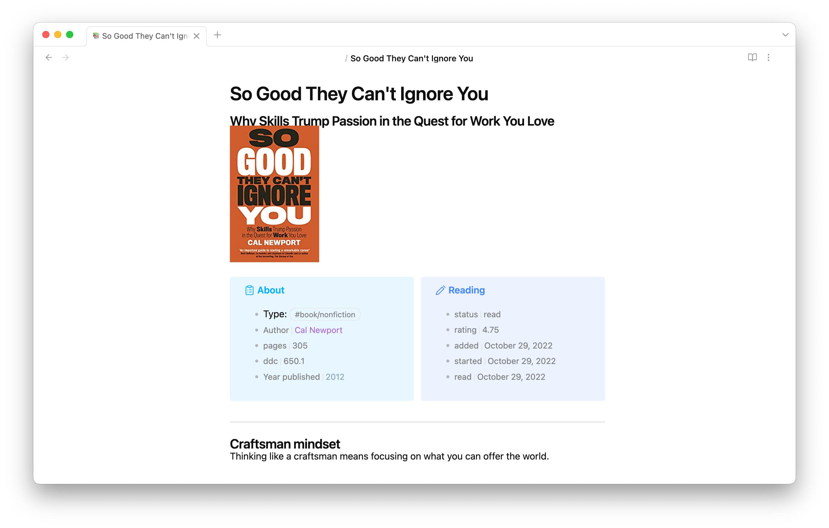
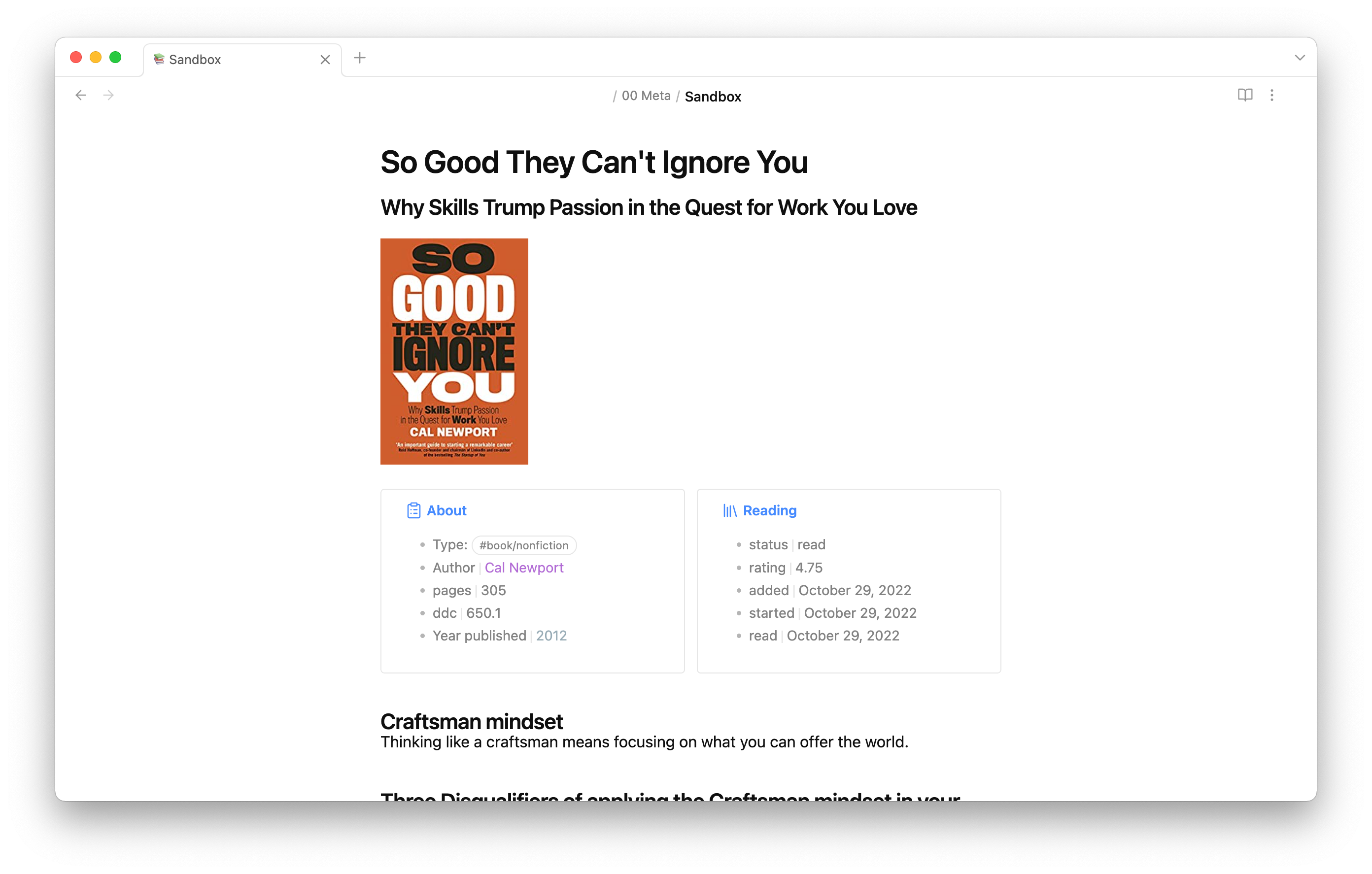
I added a bit of styling and am pretty happy with the result:
Implementation
The two callouts that are displayed side by side are actually encapsulated by another callout. This callout arranges all its content in columns.
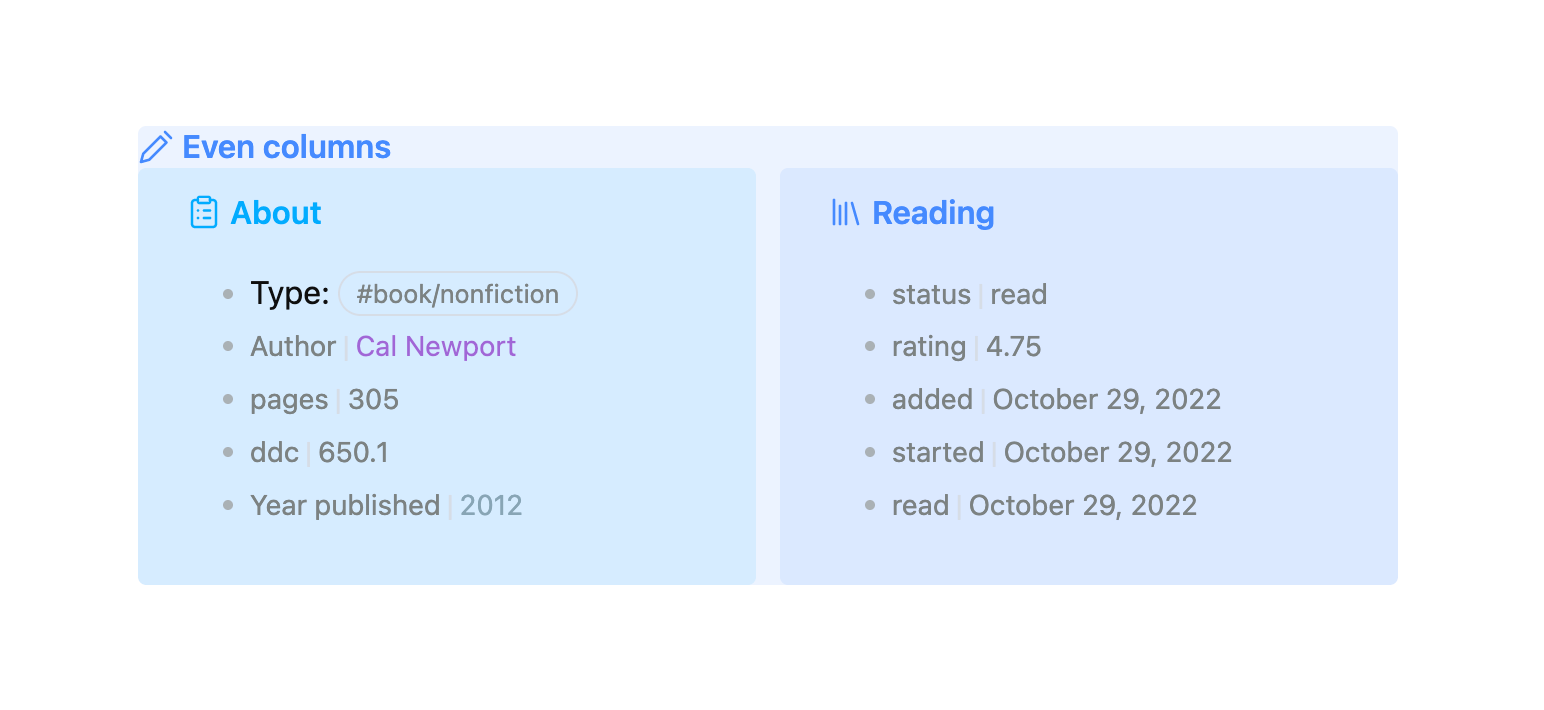
This is what it looks like in the note:
> [!even-columns]
>
> > [!abstract] About
> >
> > - Type: #book/nonfiction
> > - [Author:: [[Cal Newport]]]
> > - [pages:: 305]
> > - [ddc:: 650.1]
> > - [Year published:: [[2012]]]
>
> > [!bookinfo] Reading
> >
> > - [status:: read]
> > - [rating:: 4.75]
> > - [added:: 2022-10-29]
> > - [started:: 2022-10-29]
> > - [read:: 2022-10-29]
A CSS snippet in Obsidian applies the styling.
.obsidian/snippets/callouts.css:
/* Even columns */
.callout[data-callout="even-columns"] {
  /* Removes padding and background colour from the container */
  padding: 0;
  background-color: transparent;
}
.callout[data-callout="even-columns"] > .callout-content {
  /* Arranges the content in columns */
  display: grid;
  /* minmax sets the minimum width of a column. Make the columns 'skinnier' by setting 15rem to a smaller number */
  grid-template-columns: repeat(auto-fit, minmax(15rem, 1fr));
  gap: 12px;
}
.callout[data-callout="even-columns"] > .callout-title {
  /* Hides the callout title */
  display: none;
}
That’s it! Simply copy the above code into your snippets folder and activate it. Anytime you add a callout with the name even-columns, the content inside is arrange in, well, even columns.
What we are using here is a CSS property called grid. You can read more about grid at CSS-tricks.
The great thing about grid is that it is really flexible. Each new line in our callout automatically moves into a new column.
> [!even-columns]
> left
>
> center
>
> right
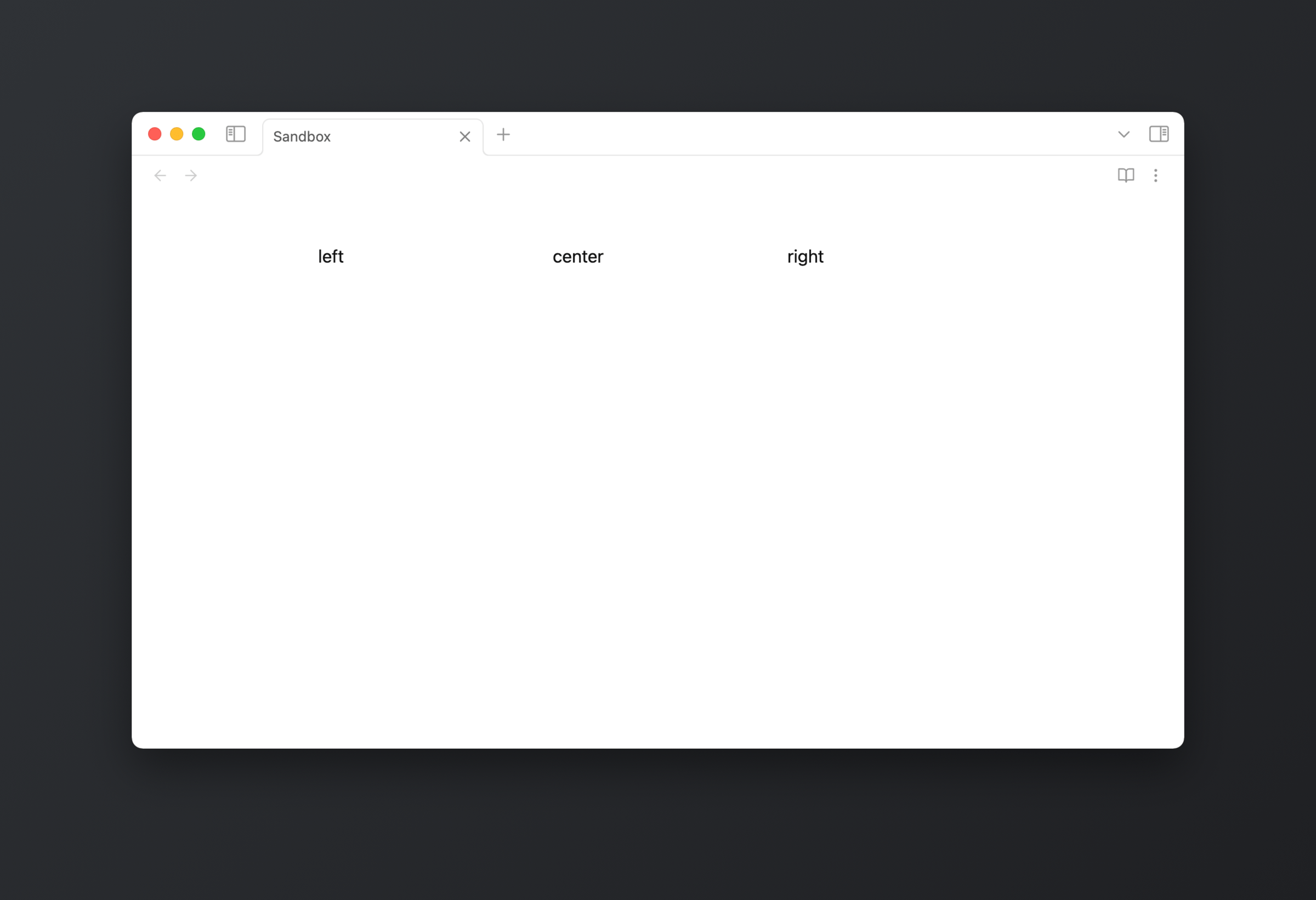
On a smaller display size, for example on mobile, the columns stack responsively depending on how much space is available.
There are a couple of plugins out there that implement this functionality and might offer a bit more fine-grained control. For a basic use-case like mine, it is quite impressive how far you can get with a callout class and some CSS. It’s great how much customisation Obsidian already supports out of the box.