Emphasis–Relevance and the problem with hyperlinks
When styling text on the web, there are several different options to add visual1 emphasis: Text can be bolded, it can be rendered italic or an underline can be added. Additional to those common methods of highlighting, there is another interesting way that we can use in our projects.
Emphasis by text contrast
In Version 0.1 of this blog, I used a drop-in collection of CSS styles called water.css. It applies some basic styling after being added to the <head> of a website. This helped me to get started writing blog posts (the hard part for me) instead of fiddling with the CSS (the easy part for me).
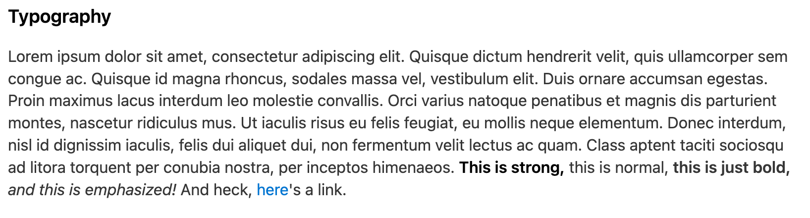
One thing that I really liked about water.css is the --text-bright property. It makes text stand out from the surrounding text by having a higher contrast. You can see the difference between the text that is strong and the text that is bold.
I shamelessly stole this idea and implemented it in this blog. Links and inline code is slightly darker than the surrounding text:
Once I was aware of this ‘design pattern’ I started seeing it being used in multiple places:
Kent C. Dodds’ blog highlights bold text and code through use of text contrast:
 —
— 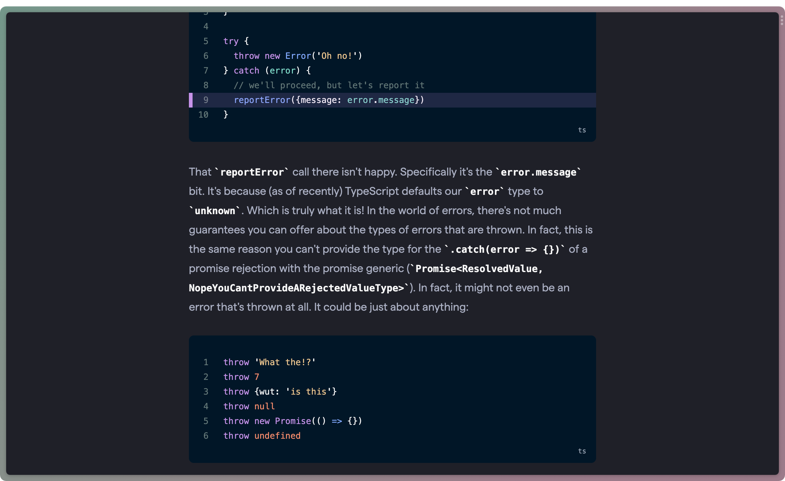 — Get a catch block error message with TypeScript
Chris Coyier’s blog also highlights text, code and links through higher text contrast:
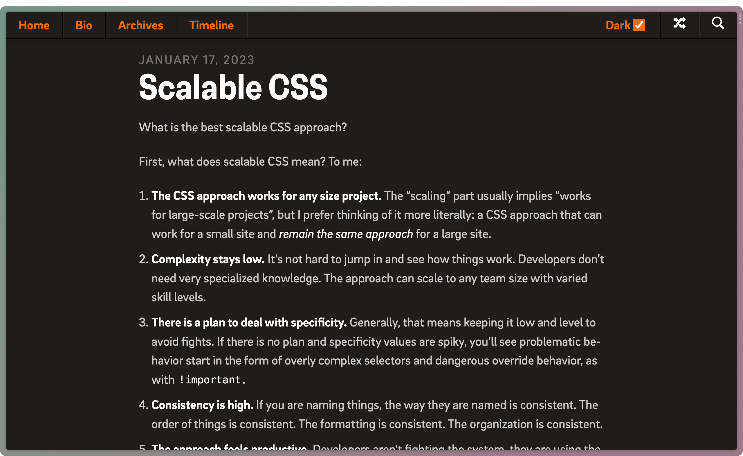 — Scalable CSS - Chris Coyier
Responsible Emphasis
It is great to see creative ways of highlighting text because it lets us fine-tune how much weight to give. Contrasting text color is more subtle than bolding and underlining it. The degree of emphasis to an element should correspond to its relevance for the user.
The Emphasis–Relevance Matrix:
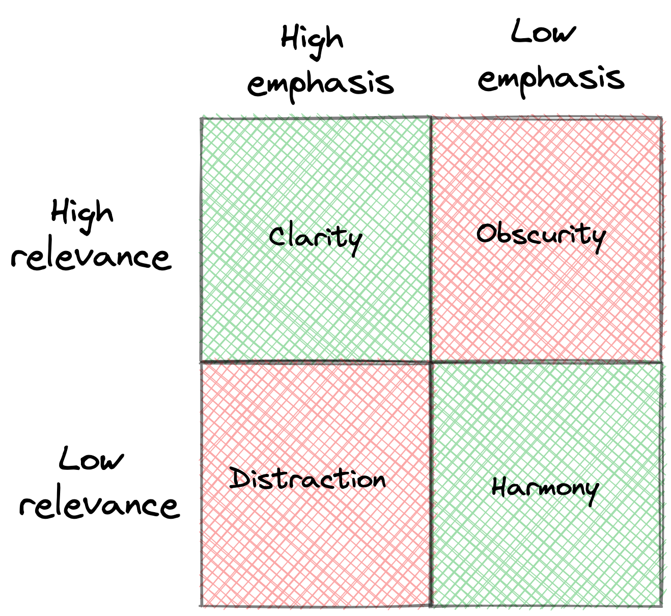
- High emphasis and high relevance: Content that is important to the user and hence is highlighted. Real-life examples are red lights, ambulance sirens or a phone ringing.
- Low emphasis and low relevance: Content that isn’t relevant to the user and thus doesn’t require attention. In long-form writing, each individual word is a part of a greater paragraph and recedes into the background.
- High emphasis and low relevance: Unfortunately, in the ‘attention economy’ of the internet, this design pattern is all around us. Clickbait, pop-up banners and animated ads are just some examples of how content that is unimportant competes to get our attention.
- Low emphasis and high relevance: Content that is important but hard to make out. Insufficient colour contrast like light grey text on a white background obscures relevant information to the user.
There are several ways to use this matrix as a mental model. Bionic Reading highlights only the beginning letters of each word in an attempt to improve reading speed and comprehension2. Low-contrast colours schemes like Zenbones can help to actually read the code instead of jumping from keyword to keyword3.
The problem with link styling
By default, hyperlinks are underlined and in blue. While the styling might change from site to site, this design pattern still influences what links look like on the web.
Often, this is not a problem. However, if applied without reflection, link styling often gets the balance between relevance and emphasis wrong.
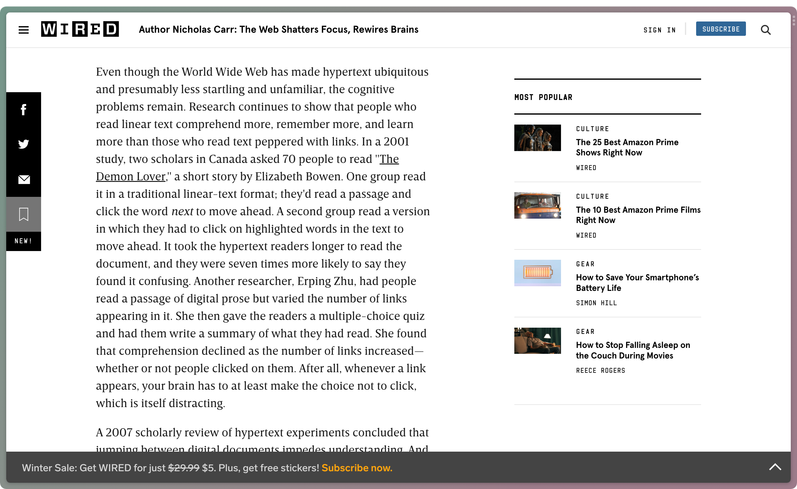
The text that clearly stands out in emphasis from the surrounding part is “The Demon Lover”. However, the title of this book is hardly the most important takeaway from this paragraph.
Highly emphasised links, as they are so common around the web, impart a significant penalty on our comprehension of a text. This has been found by a study which the website above describes. When scanning a text, our eyes jump to the emphasised links that rarely are the key points of the paragraph.
In most use cases, specially long-form writing, argue that links are more comparable footnotes in relevance. Footnotes provide reference material that is supplementary to the main text, but not relevant to understand it. In the same way, links allow you to go deeper or check the sources, but they aren’t required to follow the text nor are they the main point.
Hence, links should be styled with similar emphasis to footnotes.
Subtler link styling
I first came across a less attention demanding link styling in Matthew Butterick’s web-published book Practical Typography. Links are indicated by a degree sign (°) in red instead of an underline and colour. This allows the reader to focus on the text, rather than scanning the links.
The LessWrong forum does a similar thing:
Links are highlighted by colour, with internal links being denoted by a degree sign.
Link styling on this blog
Inspired by the above examples, I try to reduce cognitive load through links by keeping them subtle.
Links are denoted by a circle character and are highlighted on hover4. Internal links (to other blog posts or public notes) are followed by a filled, green circle, while external links are indicated by an outlined, bright pink circle.
Behind the scenes, this is powered by pseudo-selectors in CSS:
a {
  --clr-sign: var(--clr-accent);
}
a::after {
  content: "◦";
  color: var(--clr-sign);
  position: relative;
  margin-left: 0.05em;
  font-size: 90%;
  top: -0.35em;
}

.internal-link {
  --clr-sign: var(--clr-accent-secondary);
}
.internal-link::after {
  content: "•";
  margin-left: 0;
}
Conclusion
I am not a UX designer and have not studied graphic design. There is a good chance that my aversion to underlined links misses the mark and that there are benefits that I missed. If so, please point them out to me!
As people who paint the web, we have a responsibility over the attention of the people who look at our sites. By thinking about the way our design impacts users and exploring novel ways, we might be able to build a web that is clearer, more harmonious and better for everyone.
Footnotes
- As a sidenote: Visual emphasis is not the same as semantic emphasis. Although
<em>and<i>both render text italicised by default, their semantic meaning is different: The Emphasis element - HTML | MDN. Markdown-it compiles*italic*to<em>italic</em>by default. This is incorrect semantics for many use cases, like book titles, where<i>is the appropriate element. I am unsure how to square Markdown’s simplicity of writing with its lack of fine-grained semantics. ↩ - Bionic reading sounds pretty neat. However, a preliminary study by Readwise found no positive effect on reading speed when using bionic reading. In fact, speed was actually slower: Does Bionic Reading actually work? — Readwise Blog. ↩
- Light/Dark Toggle for Neovim, Fish, and Kitty — Evan Travers ↩
- The neat hover animation comes from a comment in a CSS-Tricks article. ↩